Digital Magazine
Scope: 1 week
Role: UX Designer
Overview
The Cipher was the product of a publishing workshop during which a group of 18 Columbia Publishing Course students came together to create a digital and print magazine in only a week's time. My role within the 'magazine company' was UX designer for the digital edition of the magazine, and I worked side-by-side with the digital visual designer, as well as working closely with the entirety of my team (editors, publishers, marketers, print visual designer, etc).
This was my very first experience with UX design, something that I had previously only heard about in passing but had no experience with.
The concept for our magazine was decided on by the team: sci-fi and comics fandom. We felt this would be an exciting topic and audience to design for, and many members of the team were big fans of superhero movies and comics, Firefly, Harry Potter, and other large ‘fandom’ communities.
“The Cipher is a magazine for sci-fi, fantasy, and comics fans who know the characters of their favorite TV shows and books as well as they know their best friends.”
By the end of the week, we had to develop a full digital layout for the home page, menu, and article pages of the website; print layouts for the same content in print; several articles of real content; and a business plan with demographic research, operating costs, a target audience, and circulation estimates.
Design Challenge
Process
The visual design team and I studied similar web and print media, and researched each brand's target audience. The greatest weakness of our competitors, especially digital, was a complete lack of visual design and interface, and a general failure to modernize and respond to changes in technology, design, and audience since the mid 90s. Most web publications focus simply on getting up any and all information to their audience, and aren't built to present or organize this information for their users' benefit. Most print publications treat their audience as an underground, niche group with monolithic interests.
“Readers age 22-40, both men and women, want contributors who use the jargon, get the references, and care as much as the fans do.”
As a team, we defined our target audience, and the differences between subscribers and casual readers. We pulled this information and our potential circulation numbers from looking at similar magazines and their readers: Rolling Stone and Empire to represent entertainment magazines covering film and TV, The Magazine of Science Fiction and Fantasy as the most circulated in its category, Nerdist, and PC Gamer for a look at an overlapping and analogous audience.
Based on our known target audience, we built a visual brand identity from scratch. We combined the clean and simple aesthetic of more visually-oriented brands such as Vogue and Mashable, with the iconic illustrative style of Marvel and DC comics to create a tasteful, high-contrast design that was built, and not adapted, for viewing on the web as well as print. Specifically, we created a design worthy of mass consumption by a diverse audience.
“The Cipher takes the entertainment magazine to a new level, not just providing content, but interacting with and understanding its readers in a way that no general interest magazine could.”
Despite the research involved in creating our brand identity, the experience of designing the website for The Cipher focused largely on information architecture, wire-framing, and best practices for responsive design and magazine layouts; rather than market research, usability, and testing.
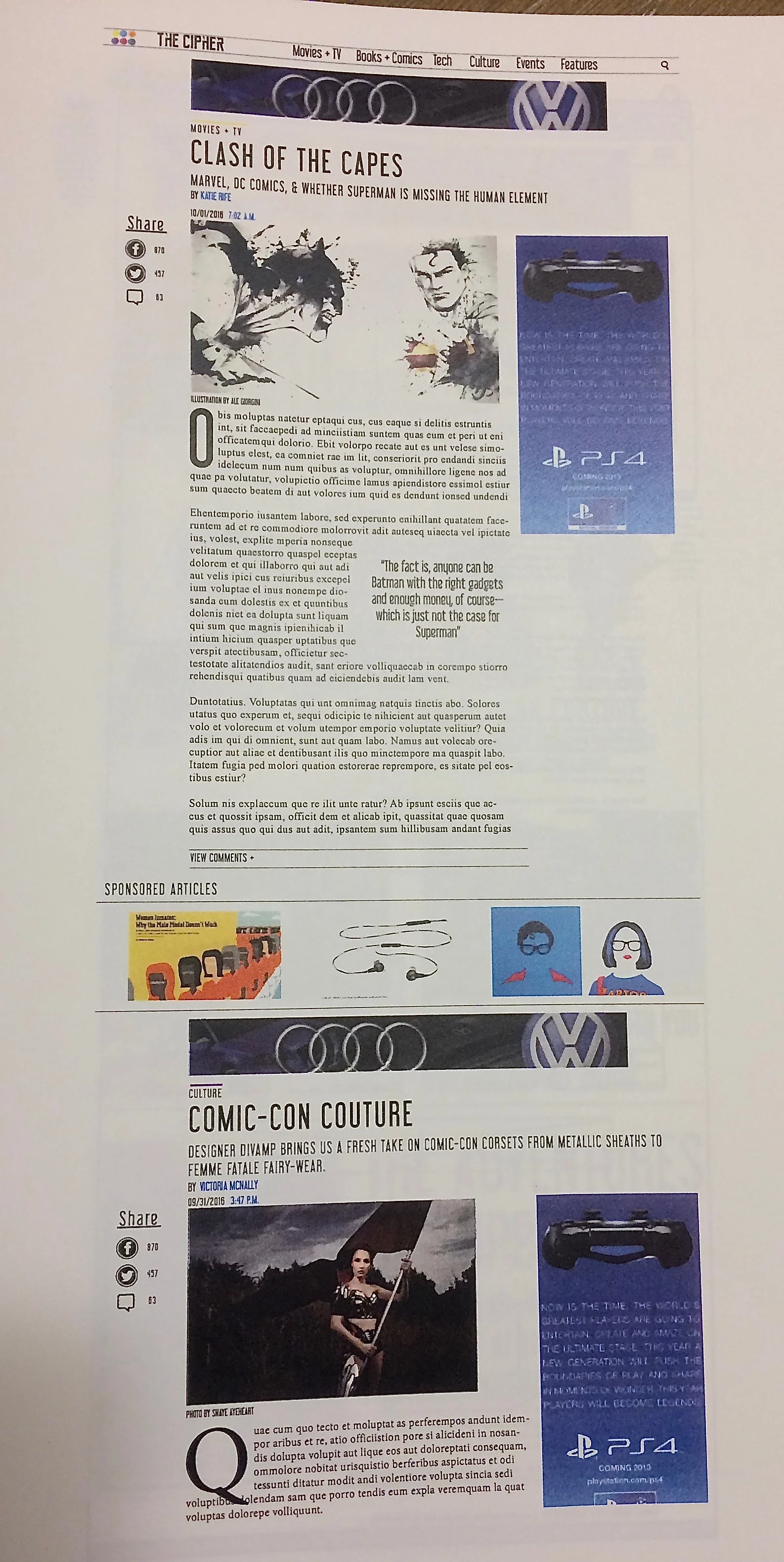
Working as the only UX designer, I sketched about two dozen of design variations with pen and paper, seeking the input of my team to vet and test them before iterating. Once we established a visually distinct theme and familiar layout that could be applied consistently across all pages of our website, I used Balsamiq for the wireframes and lo-fi prototyping. As a publishing company, we had to create a workable budget and account for a revenue stream. Advertising was an important part of our budget, so our website built ad space into our design. How to display these ads and set them apart from native content was an important consideration in our design. The digital visual designer and I worked together on basic structural choices, and she applied complete visual design in Adobe Photoshop.
I crafted the following UX/IA statement for our 'company' prospectus, drawing the reader behaviors from information on visitors to our competitors’ websites:
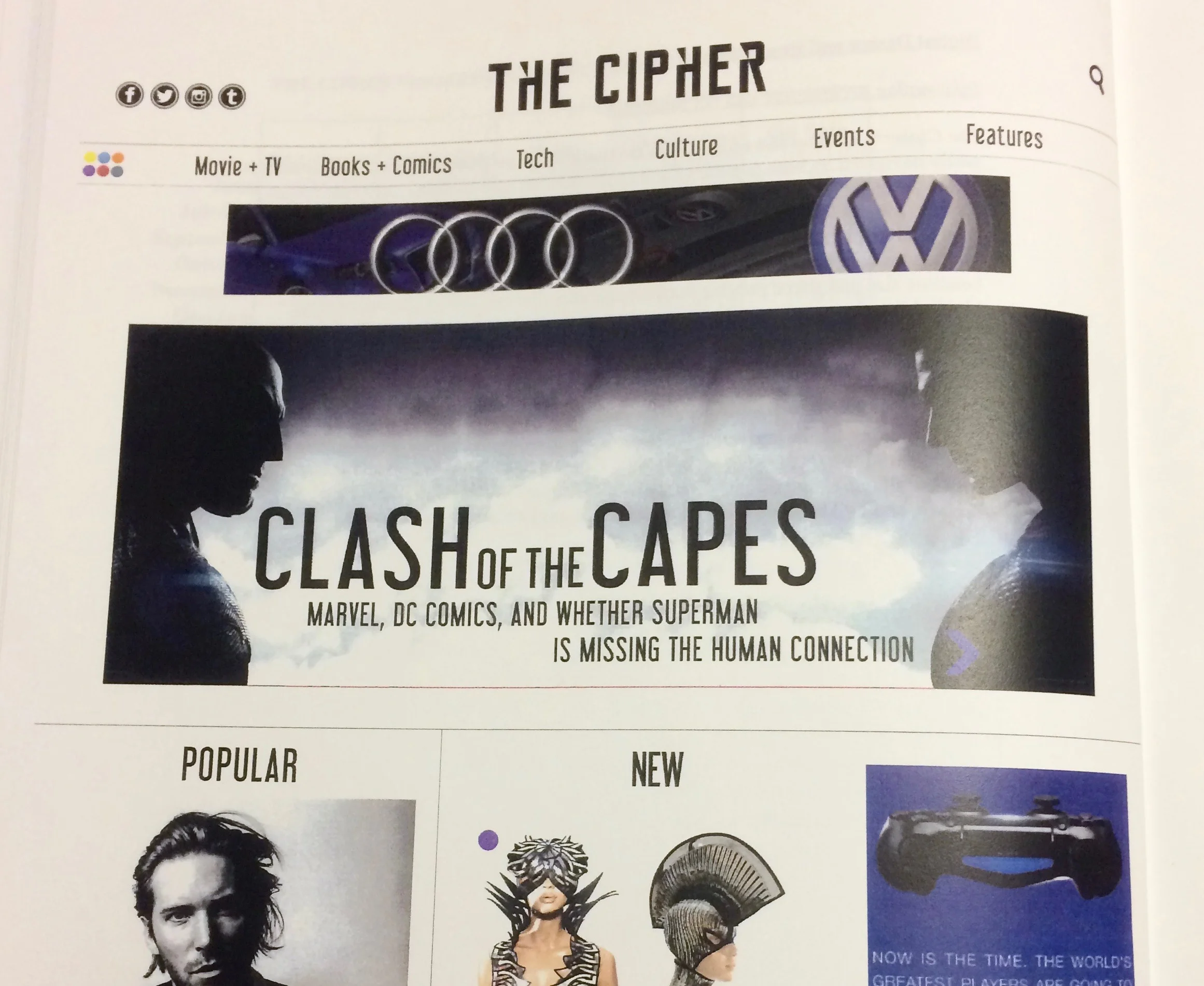
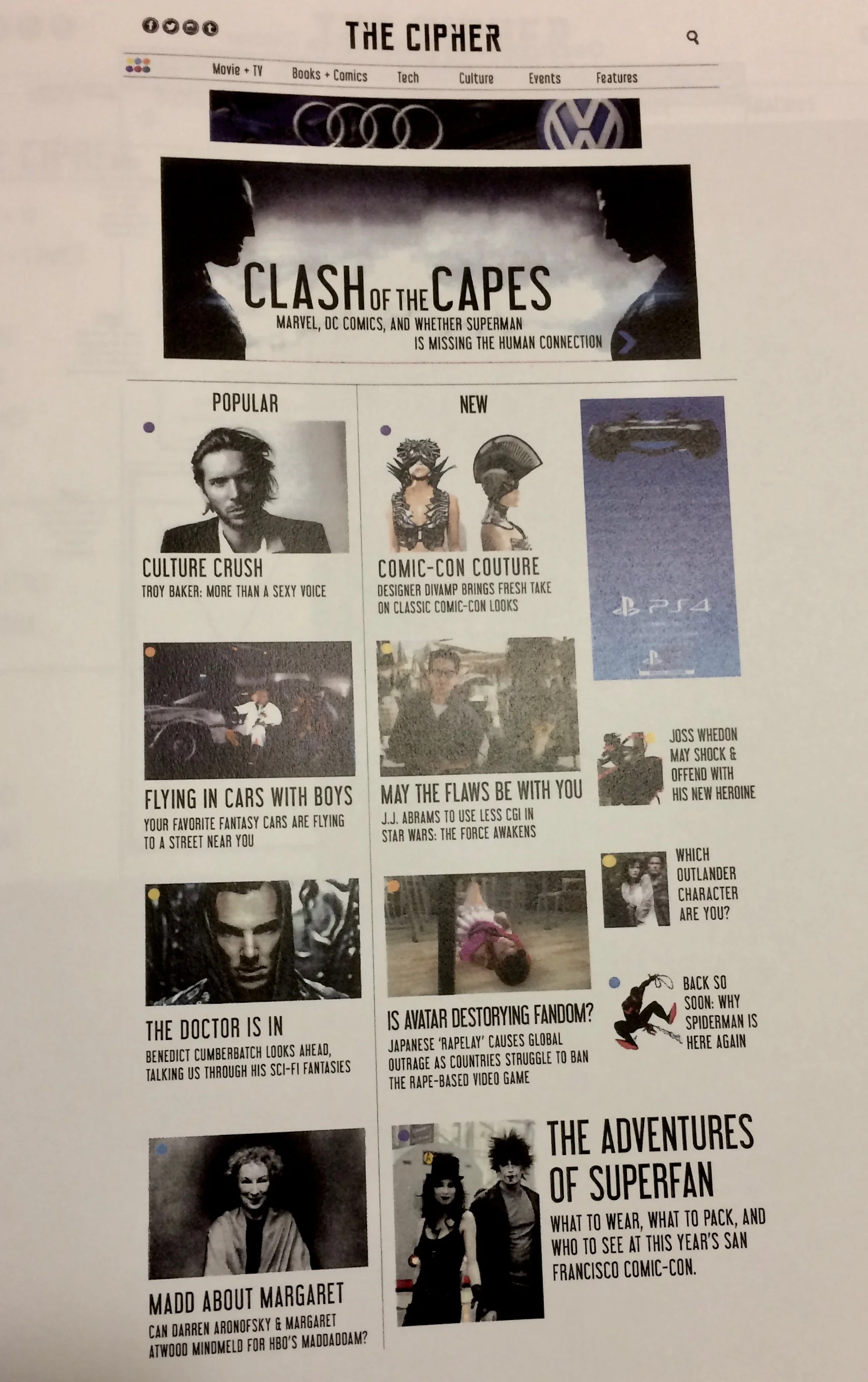
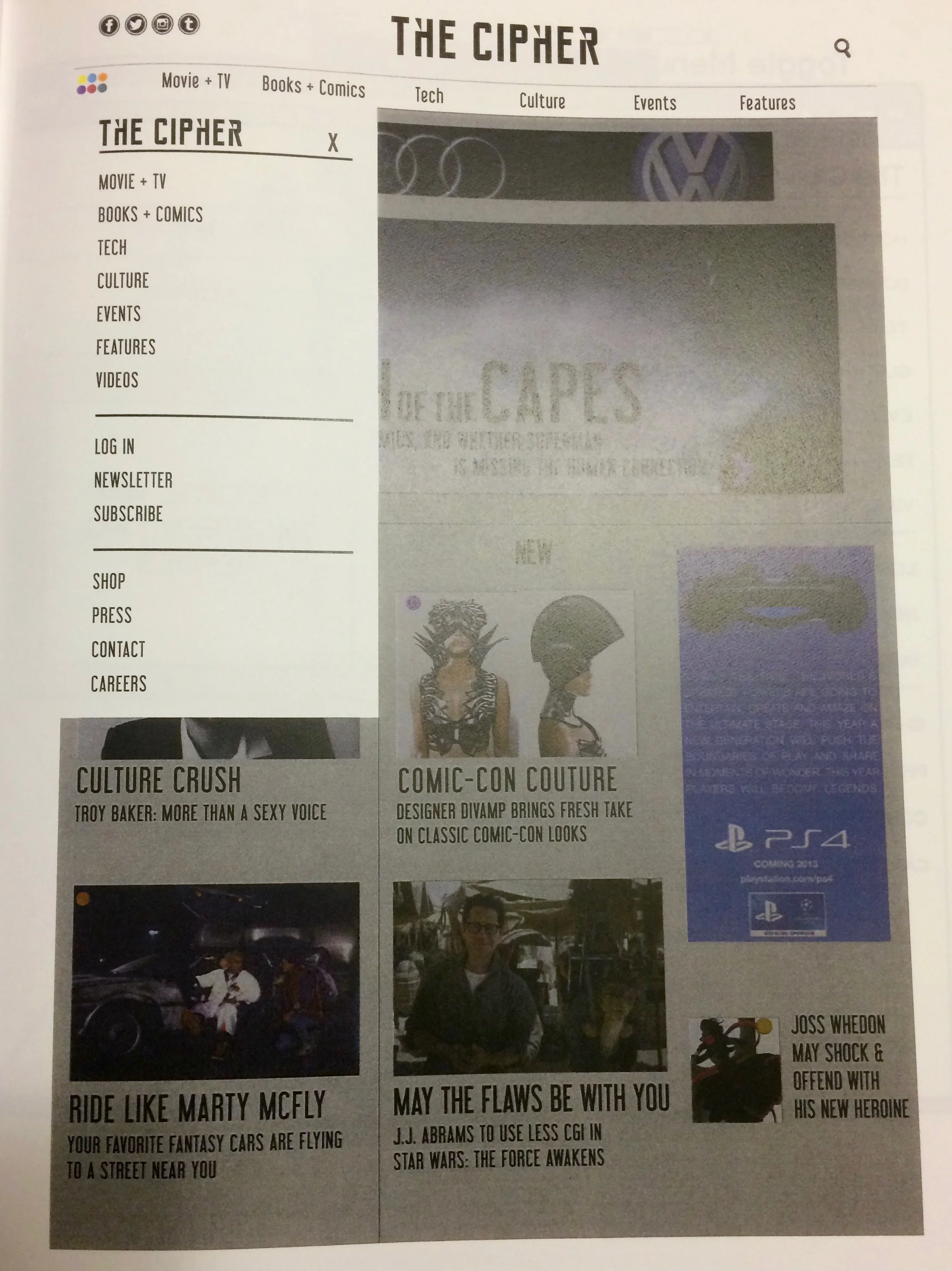
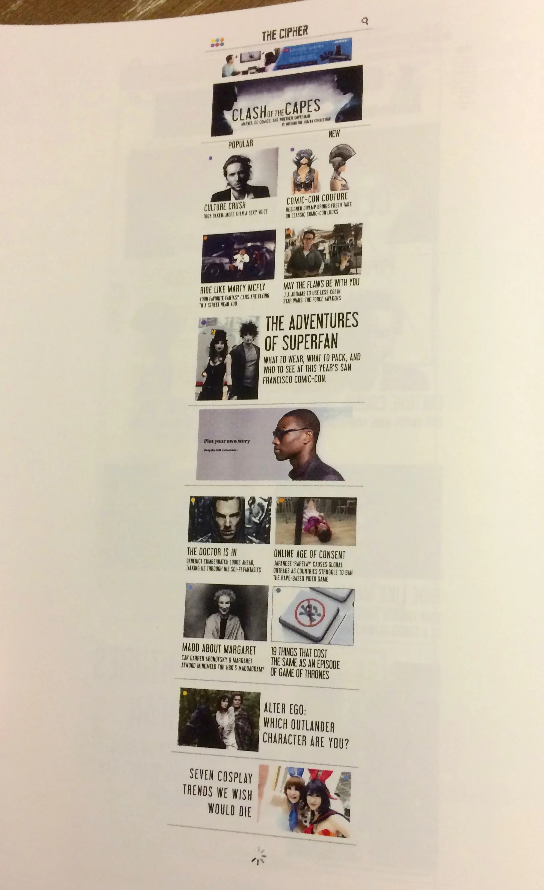
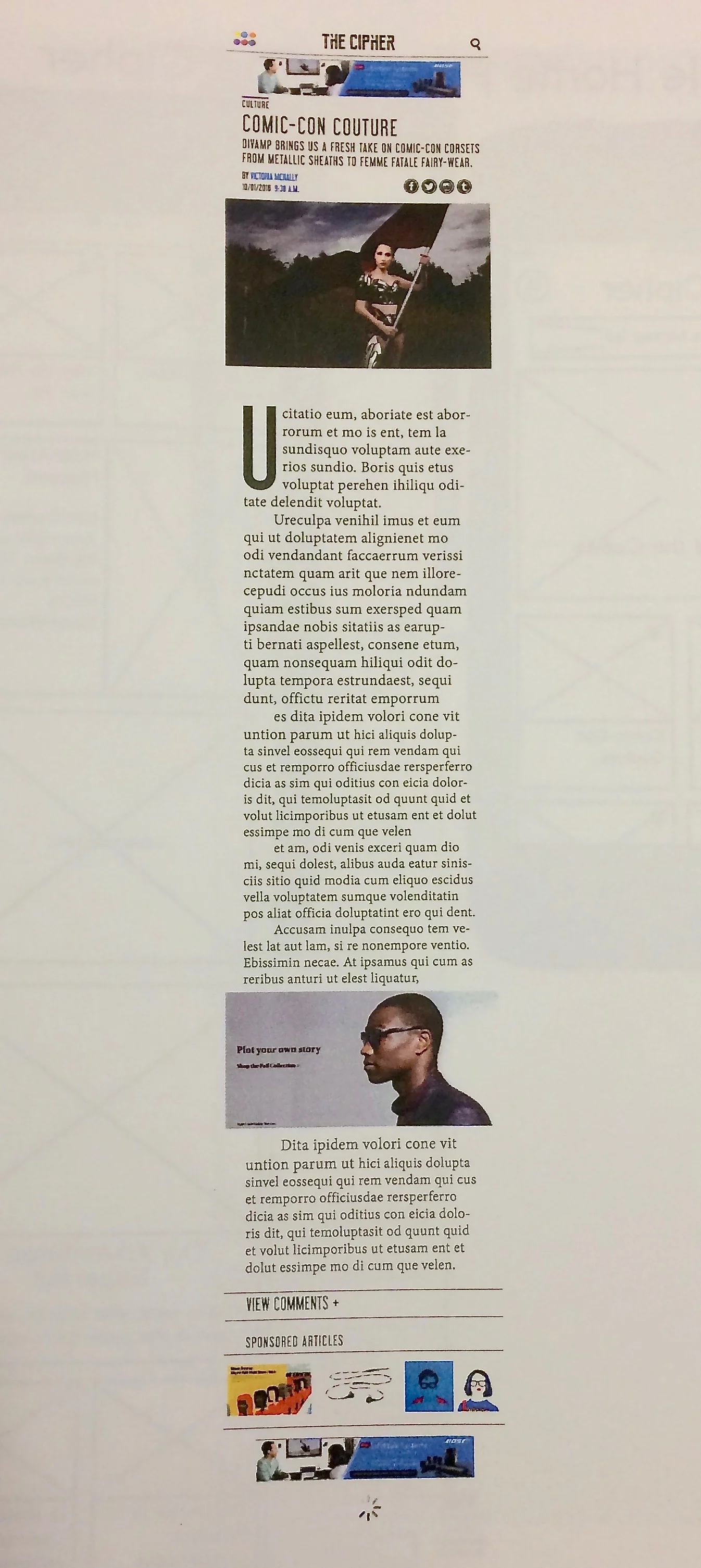
The Cipher’s desktop and mobile sites are designed to be sleek and sharp. Our content is easily navigated by both popularity and recent articles, and is sorted into clear verticals. These categories are built from the most commonly searched types of science fiction content: movies, comics, comic cons, and cosplay materials, among others. Our article river is divided into thirds, to curate our material based on topic and interest, and to provide the user with an organized and complete site experience. Variation in image and headline size and shape provide hierarchy and draw the eye across all our features, highlighting the most exciting content. Our site is built with responsive modules to maintain image consistency across mobile, tablet, and desktop versions of the site. The typical user enters the mobile or desktop site through a shared article, rather than the home page, and encounters related and recommended articles effortlessly with our infinite scroll. The user generally reads the next article in line, then engages the menu button to bring up the vertical categories. They can then search for their top interests and new material to capture their imagination. Our site has higher-than-average engagement because all our content stems directly from our users’ interests in science fiction and fantasy, and builds on their desire to learn and explore across the subjects.
Result
The final digital deliverables were examples of the homepage, the toggled navigation menu, and an article page, all done for both desktop and mobile. Annotations on motions and interactions on the webpages were also provided in the wireframes.
Although the research on potential readers was largely not done firsthand but pulled from other companies’ reports (or drawn from our own observations of friends), this was a very exciting project and was my first experience with UX design! I had a mentor, Tyler Stewart, giving advice and feedback to the various UX designers in the course. I largely used this opportunity to do research into best design practices, information architecture, psychology behind screen usage and attention, and basic design research methods, and usability testing. This project is what sparked my interest in pursuing UX and interaction design.
